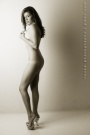
May 13, 2008 10:36pm As for favorites, it's between this one and the other nude on the chair (with the wine glass). This one here has the great simplicity of the background going for it, which separates the model nicely, but at the same time it's a lot of empty space there serving no ostensible function upper-right. The model looks gorgeous here, as this pose really flatters her body: knees, arms, shoulder, breast, buttocks, ankles. I feel like the particular seating she has here makes it seem a little uncomfortable, as her right hand and left leg are desperately trying to stabilize lest the weight on her right leg cause the stool to slip. Normally this wouldn't be a problem but it makes for the exceedingly sharp angle in the left knee, and for the uncomfortably large open space between the right arm and the back. It seems her right arm should either be a few inches closer to her buttocks or she should be seated a tiny bit back. Maybe this all this means that the stool is simply too high.
At any rate, it seems the right shoulder is being twisted back to give support, but the rest of the body is facing forward. there is no other torso in away from where the hips are pointing. This may also be why this seems a little awkward. if maybe her hips were rotated toward the camera say 15 degrees her leg would be higher up on the stool and she would have more support, and then there would be a natural twist stemming from the foot through the hip and then through the torso to the supporting arm, and the elevated arm would then be given more emphasis, as there would be a line in the center of the torso running into the left arm. Her neck could also then be turned a bit to give more dramatic effect.
All that aside, the exposure is good but I wish I could see more of her hair, and maybe a wider range of tone son her skin, though the muted gray does have its own charm. I think maybe if there were more tones in the skin, especially lighter ones, there would be greater contrast with the stool, and the stool would thereby become less important. then the stool would blend in more easily with the background by comparison, and the space upper right wouldn't be so unbalanced by all the structural activity lower-left. Then the model's body would form a lovely, twisting diagonal form running upper-left to lower-right.
At any rate, a captivating shot. Lots of subtle things to play with in this setup. I like.