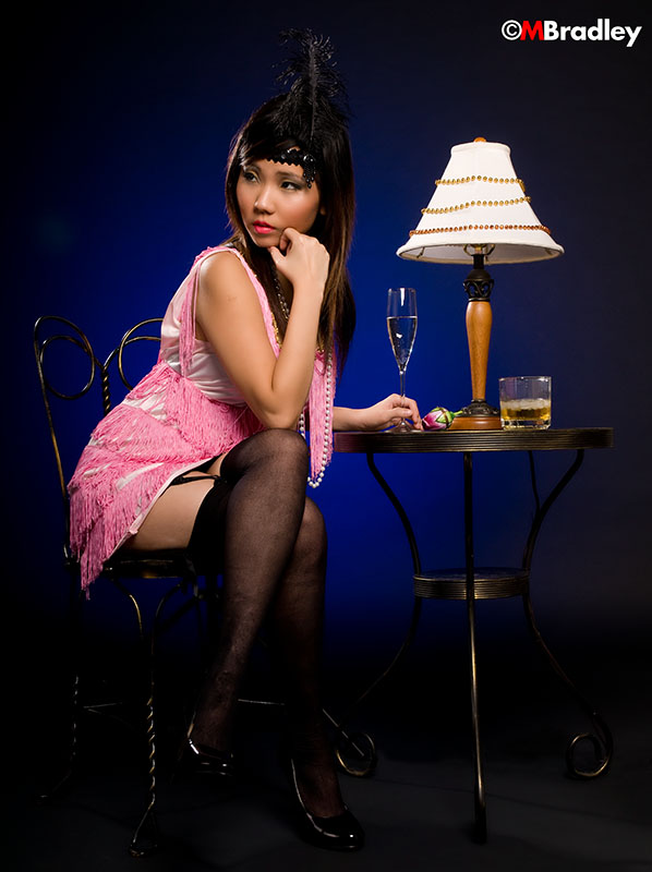
November 09, 2008 12:07am I like the image of you, the pose is great, but the photographer misplaced you in the frame. When you look to the picture-left more space needs to be there between your eyes and the frame. Literally you need some space to look into.
Both the top of your head and your legs vanish into darkness - a sign of bad lighting.
The bright neon effect of the photographer's logo in the upper right is terrible - it detracts from the composition.
October 10, 2008 11:17am I LOVE THIS PICTURE JUST HONESTLY WISH YOU HAD SOMETHING THAT MADE IT POP! I DON'T KNOW IF THAT MEANS THE COLORS OR WHAT BUT, OTHER THAN THAT IT IS FRICKIN FRICKIN AWESOME!!!! MWUAH KT
October 08, 2008 11:54am Aw no comments on this? PPl are so stingy eh?!!! U look gorgeous here its an unusual setting I know but still u bring it to life;)